Last summer, while working on the visual overhaul of Textio’s website, those of us on the design team struggled with the fact that our main brand font, Source Sans Pro, wasn’t working quite as well as we would have liked. Though we had landed on a solid choice for the core writing experience itself (Charis SIL), all of the surrounding interface remained in Source Sans Pro. But with all of the other big changes we were making (and since none of us had actually identified a better font at the time) we decided to table the font discussion.
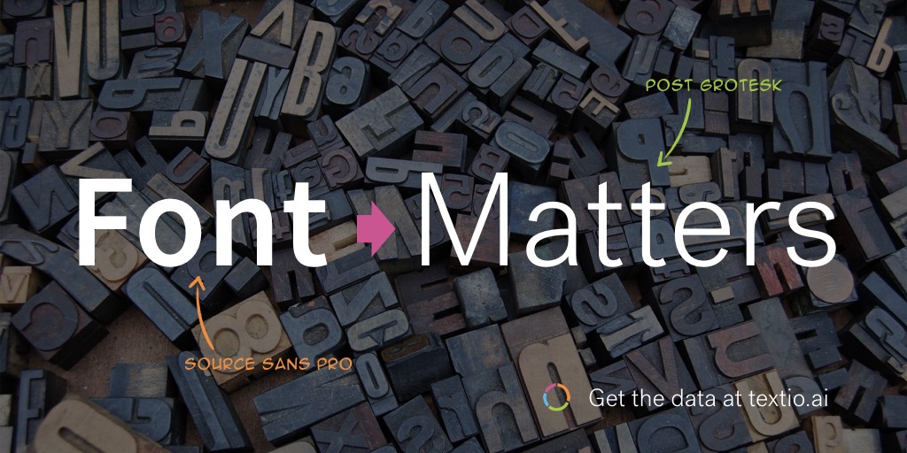
The issue kept percolating in the background, and eventually we discovered a font that looked like a clear winner over Source Sans Pro. So last week we changed Textio to our new font: Post Grotesk.
But what does it mean for a font to “work well” or not? Let’s face it, to most readers these two fonts are not that different.

Readability, usability, and customer engagement
For starters, Textio is a text-centric product. Aside from the fact that “text” is literally in our name, the way that customers engage with Textio is by creating and editing documents within our augmented writing platform. So for us, a font decision is ultimately about usability.
One of things that Textio’s predictive engine frequently sees in analyzing the hiring outcomes of tens of millions of job posts is that visual text formatting can have an impact on reader behavior. Of course, this makes intuitive sense: if you don’t optimize your job post’s readability by adding bullets to certain content, or by editing it down to an appropriate length, then many people are simply going to stop reading and move on, because understanding what you intended to say is too difficult. Part of Textio’s editing guidance is to tell you exactly when you need to adjust the formatting or length of your text based on statistical outcomes of past job posts.
Also obvious, but worth stating: it’s important that we follow our own product’s guidance! We have an obligation to ensure that Textio’s website is optimized for the reader. A big part of that is using a font that is easy on the eyes in general, but also that tests out well across the widest range of operating systems, browsers, and screen resolutions so that Textio’s usability is optimal for everyone.
We always felt that Source Sans Pro was both easy to read and “on brand” for Textio. But sometimes we would hear from a customer (usually folks with smaller or lower-resolution screens) that the text was “breaking up” at small sizes. We tried and tested a number of other fonts that might technically have solved this problem, but they would have hurt the experience for most other writers. None of those fonts seemed to have the kind of smart, light, understated sophistication that we’ve always tried to build into the design of Textio to make your work easier.
“Maximum usability”
Post Grotesk, which was created by Brooklyn designer Josh Finklea, seems to achieve that goal for Textio with ease. In Finklea’s own words, he was trying for an “amiable typeface with maximum usability and an overall sense of neutrality.” We definitely think he succeeded. And we have found that the 300 weight of Post Grotesk is just exactly heavy enough to hold up well across the broadest range of browsers and screen resolutions, while still being light and easy on the eyes.
I think this review of Post Grotesk from Typographica captures much of what really works about this font for Textio: that it has an airiness and playfulness while “also outwardly displaying a serious bite.”